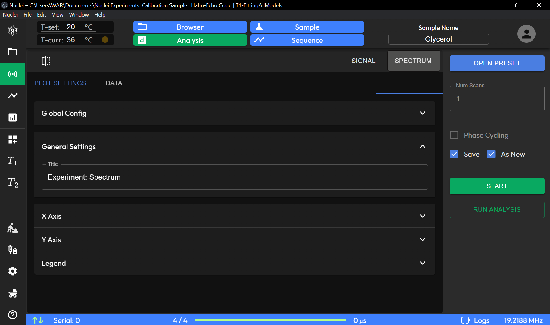
Plot Settings
The Plot Settings page provides various configuration options to customize the appearance and behavior of experiment data plots. See also Experiment Data Preview Toggle.
Experiment Data Preview Toggle
The Preview Experiment section allows you to manage and visualize experiment data.
The Experiment Data Preview Toggle submenu allows users to fully customize the visual appearance and presentation of data from any plot component in TQT Nuclei. This powerful tool offers a variety of options for adjusting how experimental results are displayed, providing flexibility for both data analysis and presentation. Additionally, it allows users to download the raw data directly from the plot for further processing. Below are the key customization options available in this submenu:
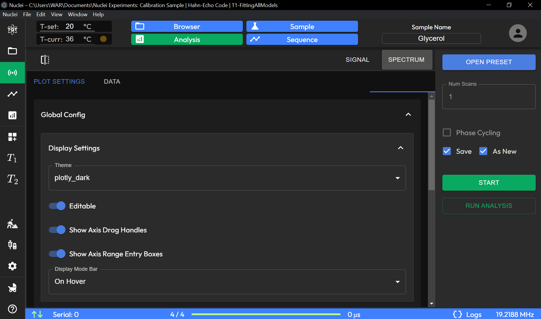
- Plot Theme
Users can change the overall theme of the plot, selecting from several predefined themes. This option adjusts the background color, grid style, and overall aesthetics of the plot to suit different preferences or presentation needs.
- Graph Title and Axes Labels
Title: Users can easily change the title of the graph to better reflect the nature of the data or the experiment.
Axes: The x-axis and y-axis labels can be edited to provide more context, such as units of measurement or descriptive labels for the plotted variables.
- Legend
- The legend can also be customized in the submenu. Users can:
Change the position of the legend on the plot.
Edit the labels of each data series to make them more descriptive.
Toggle the legend’s visibility on or off.
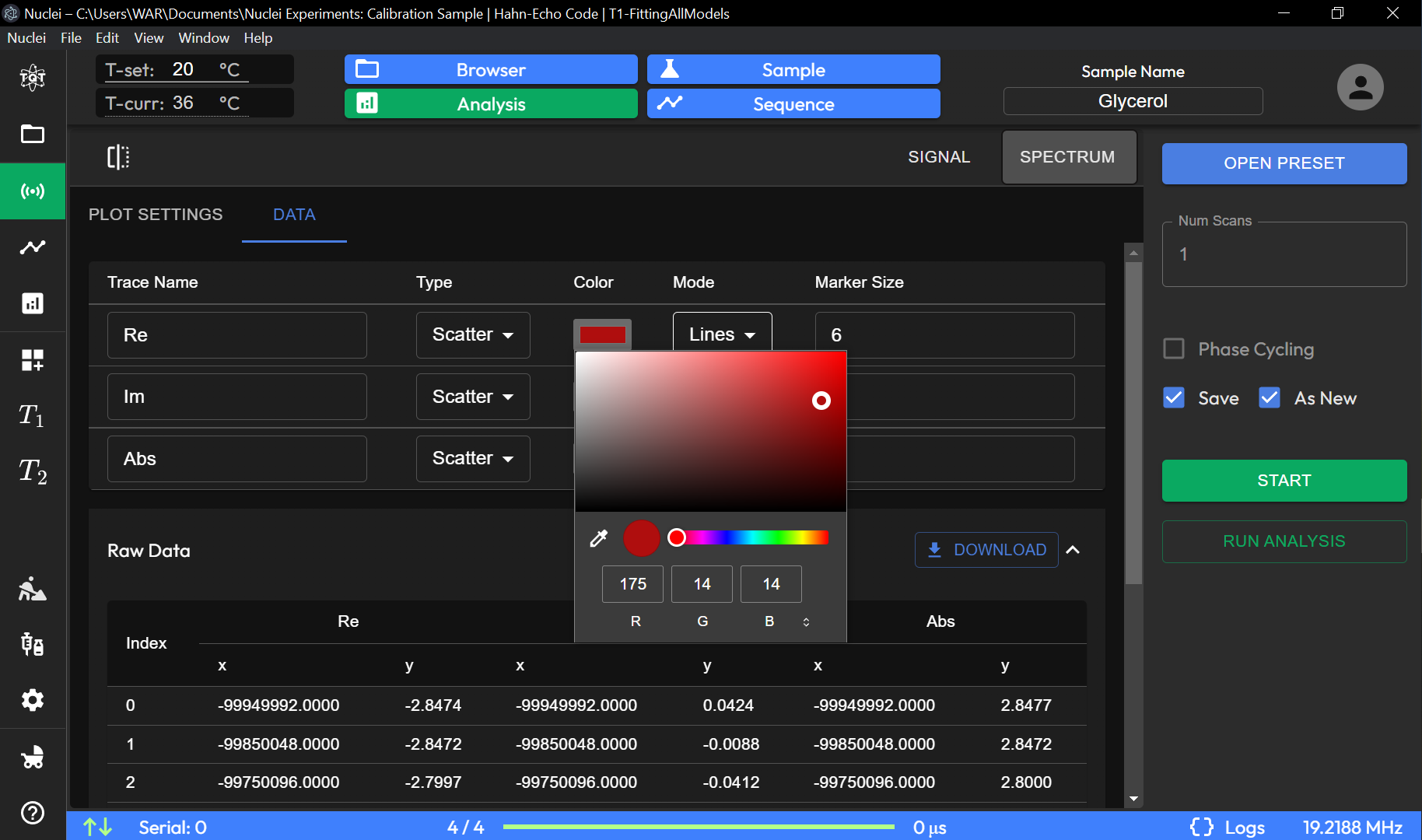
- Signal Line Color
Each signal line on the plot can be customized with a unique color. The native color palette offers a range of distinct colors, allowing users to visually separate different data series for easier comparison and interpretation.
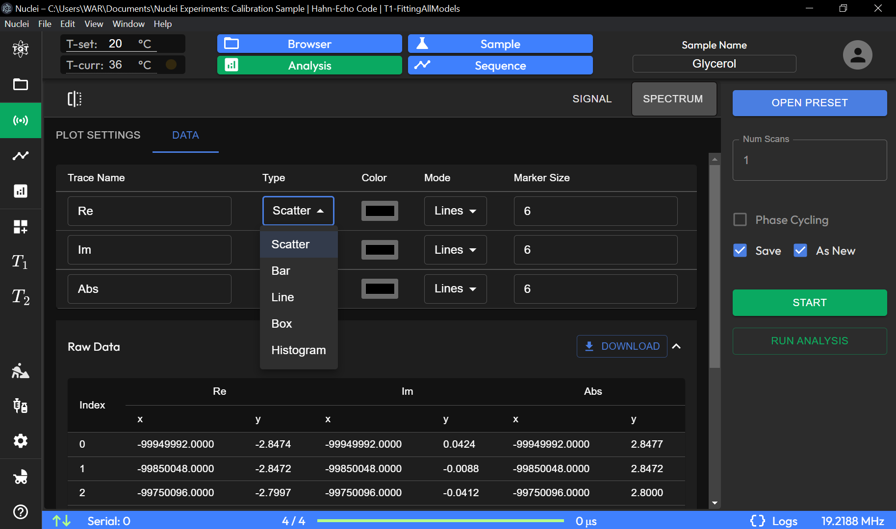
- Data Point Rendering
- The submenu allows users to choose how data points are rendered on the plot:
Scatter Plot: Displays individual data points as markers.
Line Plot: Connects the data points with lines, providing a continuous visual representation of the data.
Histogram: Displays the distribution of data in bar format.
Combined Renderings: Users can combine different rendering styles, such as scatter and line plots, for more detailed visual analysis.
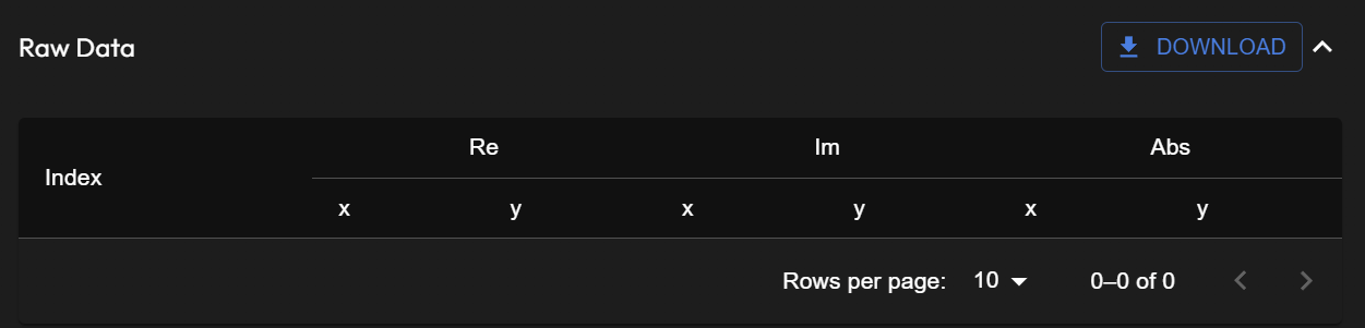
- Download Raw Data
For further analysis or reporting, users can download the raw data from the current plot directly via the Download Raw Data option. This exports the data in a standard format, such as CSV, allowing users to analyze or manipulate the data in external tools.
These customization options make the Experiment Data Preview Toggle submenu a powerful tool for personalizing data visualizations and enhancing both data analysis and presentation within the TQT Nuclei software.
UI Units Description
Plot Settings Tabs
PLOT SETTINGS: Allows adjustments specific to the visual presentation of data plots.
DATA: For handling and managing data-related configurations, accessible in this section.
General Settings
X Axis Settings: Configure the properties of the X-axis. - X Axis Title: Sets the title displayed on the X-axis (e.g., Time [µs]). - X Axis Type: Choose the axis type, such as Linear or Logarithmic, depending on the data requirements.
Y Axis Settings: Configure the properties of the Y-axis in a similar manner.
Legend Options
Show Legend (Toggle): Enable or disable the legend display on the plot to show data series labels.
Global Config (Expandable Sections)
Display Settings: Customize display options such as color schemes and background.
Image Export Options: Set up preferences for exporting the plot, such as file format and resolution.
Interaction Settings: Adjust how users can interact with the plot, including zoom, pan, and tooltips.
Other Settings: Additional settings to fine-tune plot behavior and presentation.
The Plot Settings page offers flexibility for customizing the visual representation of experimental data, making it easier to interpret results through tailored displays.